Showing posts with label 20th century US econ history. Show all posts

Sunday, February 16, 2025

Beware the Ides of March

Against best practices during our Cool Zone era, I'm going to make a firm prediction about what is going to happen to the stock market in 2025:

 In 2025 we will see a sharp sell off of stocks in March.  The stock market will hobble along through the spring and summer with a full reckoning with the many tentacled tech bubble 2.0 in the fall (probably October, maybe September).

As market predictions go, this is pretty precise.  What gives me the confidence to issue such a detailed prophesy like I'm fuckin' Muad'dib over here?  A reasonable grasp of the financial history of the US.  The US financial system is a bubble machine and it produces bubbles with remarkable uniformity.

Let’s start with the crown jewel of American financial disasters, the stock market crash of 1929.  Here, I defer to the man who wrote the book on it, John Kenneth Galbraith:

On Monday, March 25, the first market day following the unseemly Saturday meeting [of the federal Reserve Board], the tension became unbearable. Although, or rather, because Washington was still silent, people began to sell.  Speculative favorites--Commercial Solvents, Wright Aero, American Railway--dropped 10 or 12 points or more,  the Times industrial average was off 9.5 points for the day ... On the next day, Tuesday, March 26, everything was much worse.  The Federal Reserve Board was still maintaining its by now demoralizing silence.  A wave of fear swept the market and amazing 8,246,740 shares changed hasn on the New York Stock Exchange, far above any pervious record.  Prices seemed to drop vertically.  At the low for the day 20- and 30- point loses were common place.  The Times industrials at one time were 15 points below the previous day's close. (The Great Crash of 1929, p35-36)

Galbraith goes on to describe an intervention in the form of reassuring words from Charles E. Mitchell.  As head of the First National City Bank (which later became Citibank) Mitchell offered to loan money as needed to prevent more stock liquidations.  Mitchell soothed the animal spirits of the market enough for the bubble to continue going through the spring and summer of 1929.  Make a note of this, it will come up again later: A financial panic in March, followed by an intervention that keeps the system running through the spring and summer.

And then?  Well, Galbraith is a better writer than I am so I'll let him explain it.  After signs of market weakness throughout October 1929:

Thursday, October 24, is the first of the days which---history such as it is on the subject---identifies with the panic of 1929.  Measured by disorder, fright, and confusion, it deserves to be so regarded.  That day 12,894,650 shares changes hands many of them at prices which shattered the dreams and hopes of those who had owned them.  Of all the mysteries of the stock exchange there is none so impenetrable as why there should be a buyer for everyone who seeks to sell.  October 24, 1929, showed that what is mysterious is not inevitable. Often there were no buyers, and only after wide vertical declines could anyone be induced to bid. (p99)

Anyway,  I encourage you all to read Galbraith's "The Great Crash" to get a more full sense of the future-past we are about to stumble into.  This pattern is remarkably close to the pattern of financial crash in 1907.  After the Bank of England took measures that turned a gold inflow into the US into a gold outflow:

The effect showed up first in the financial markets.  Severe price declines occurred on the stock exchange early in March 1907.  Union Pacific stock, which had been extensively used as collateral in finance bill operations, fell by 30 per cent within less than two weeks.  Despite every action taken by the Treasury, and a temporary reversal in stock prices, the boom had come to an end, the National Bureau [of Economic Research] dating the cycle peak in May 1907

...

The contraction is sharply divided into two parts by the banking panic that occurred in October 1907.  From May to September, the contraction showed no obvious signs of severity.  Prices continued to rise; production in various lines flattened out but did not decline seriously, and freight car loadings behaved similarly; bank clearings held fairly stead, and there was no drastic rise in the liabilities of commercial failures.  The one significant change change was the reversal noted earlier in gold movements from new imports to net exports.  In October came the banking panic, culminating in the restriction of payments by the banking system, i.e., in a concerted refusal, as in 1983, by the banking system to convert deposits into currency or specie at the request of depositors. (Friedman and Schwartz, Monetary History of the US, p156-157)

So what explains the similarity of the seasonal pattern?  I honestly don't have a clear understanding of why March panics presage October collapses.  The October collapses are easier to explain.  Here, I defer to Charles Kindleberger:

Periods of financial stringency and crisis and panic (in the United States) occurred in the autumn when western banks drew large sums of money from the East to pay for shipments of cereals. Credit demand peaked in the autumn when the grain dealers needed money to pay the farmers. Sprague noted that the crisis of 1873 came in September because of the early harvest, that the outbreak of a crisis invariably came as a surprise to the business community and that the crisis of 1873 was not an exception. The seasonal tightness of money was well known and hence the puzzle is why it would have come as a surprise. The ‘excessive tightness’ of money from September 1872 to May 1873 caused the railroads to borrow short-term funds rather than issue bonds, which could have been seen as a sign of distress, and then the seasonal tightness precipitated the crash

Distress may be continuous or it may oscillate in its own rhythm. The crash of the Union Generale in January 1882 was preceded by three separate tense periods, in July, October, and December 1881. The panic of October 1907 was anticipated (although Sprague indicated its exact timing was not foreseeable) and preceded by a ‘rich man’s panic’ in March when Union Pacific stock, the security most widely used as collateral for finance bill operations, dropped 50 points. Markets recovered from this blow and from the failure of an offering of New York City bonds in June (only $2 million was tendered for an offering of $29 million of 4 percent bonds) and from the collapse of the copper market in July, and from the $29 million fine levied against the Standard Oil Company for antitrust law violations in August—only to succumb to the failure of the Knickerbocker Trust Company in October.  In 1929 distress lasted from June to the last week in October  (Manias, Panics, andCrashes, p101-102)

Okay, so in old-timey times financial collapses were dictated by the agricultural liquidity cycle, even as the economy increasing industrialized.  What does that have to do with 2025?  The last great agricultural business cycle was the Great Depression, and by the time that mess was all cleared up in 1946 agriculture was reduced to only about 10% of GDP.  Agriculture continued to shrink in importance to the US economy to today when it makes up only about 2% of GDP.  Surely this does not generate enough liquidity pressure on the banking system to generate this seasonal pattern.  That is true, but let me remind you of how the first tech bubble popped:


 The Nasdaq reached its peak on March 9th 2000, then had a sharp sell off.  It was flat but volatile through the summer and reached a local peak on Sept 1st.  The subsequent collapse was much more gradual than I remember.  The Nasdaq did not hit a nadir until October 7 2002.  Here we see a very similar pattern of stock market collapse to that described in 1907 and 1929.  

Those of you following until now and are anticipating that I'm going to turn to 2008 are probably thinking of the bankruptcy of  Bear Steans as the March shock and the bankruptcy of Lehman Brothers as the October shock.  Yeah, that's what I think, too.  But the 2008 financial crisis is different in some ways that should be pointed out.  Unlike the other collapses above, which are mostly stock market crashes (plus a bank panic in 1907), this was a crisis in mortgage markets. Stocks don't behave in the March/October pattern as clearly. A graph of the S&P 500 (picked because in includes Lehman Brothers stock) is mostly a line straight down starting in October of 2007, which is the right month but not the right year, with a slight bump up in spring 2008.  
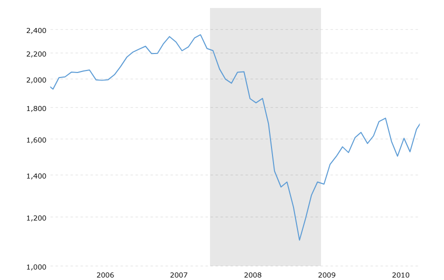
S&P 500 2006-2010

But the stock market was responding to business conditions.  The recession is officially dated from December 2007 and this adds too much noise to the stock market collapse to divine what is driving it in any detail.   Anyway, a collapse that had been in motion since the start of the year got notably more rapid in the fall of 2008.  So, this is very different from a stock market perspective.  However, the collapse of Bear Sterns in particular helps underscore the idea that "You can remain insolvent a lot longer than you can remain illiquid." That, I think, is the core of these March/October dynamics in other financial crisis. 

The two overleveraged subsidiaries that eventually brought Bear Stearns down declared bankruptcy in June of 2007.  Bear Stearns was sued that summer for misleading investors and in November the writing down of securities would result in historically rare losses and the firms credit rating was downgraded.  But still, Bear Stearns was able to postpone the reckoning until early March 2008, when suddenly investors rapidly withdrew money in a classic bank run by institutional investors.

The figure below shows the seasonal response of Lehman Brothers to the Bear Stearns collapse.  Here we see a big warning: a spike in CDS spreads with a sharp sell off of stocks in spring.  This warning blip is followed by a more gradual, slow motion collapse trhough the summer. It looks to me like the government intervention to push an orderly sale of Bear Stearns to JP Morgan Chase gave Lehman Brothers breathing room. Not pictured is the catastrophic collapse in September 2008.  

Here, I quote liberally from Wiggins, Pointek and Metrick, 2019:


After the demise of Bear Stearns, Lehman began casting around for a long-term strategy that would secure the firm’s future and allay the market’s fears. It considered several options, including increasing equity, spinning off “toxic” assets (generally real-estate-related assets) into a separate publicly held corporation, and discussing a sale of the firm, or a capital infusion, with the Korea Development Bank. Lehman was successful in raising $6 billion in equity in June 2008, despite a reported second quarter loss of $2.8 billion, its first since it went public, which was caused in part by a $3.7 billion write-down on its portfolio of mortgage-related assets and leveraged loans. But this was not enough to quell the rumors. 

A solution failed to materialize, and on September 10, 2008, Lehman announced that it expected $5.6 billion dollars in write-downs on its toxic assets and an expected loss of $3.93 billion for its third quarter. It also announced that it planned to spin off $50 billion of its toxic assets into a publicly traded corporation in order to separate them from the remaining “healthy” firm. 

The news did not have the positive effect that Lehman desired. The rating agency Moody’s Investors Service announced that it planned to lower Lehman’s debt ratings if a “strategic transaction with a strong financial partner” did not occur soon. Even though Lehman continued to desperately seek such a partner, with the intercession of the U.S. Treasury and other government agencies as described below in Regulator Nonaction, ultimately it failed to secure a firm commitment within the next week. As a result, it was unable to fund its operations for opening on September 15, compelling it to file for Chapter 11 bankruptcy protection. (See Lehman Brothers press release dated September 10, 2008 and Lehman Brothers press release dated September 15, 2008.) (Wiggins, Pointek and Metrick, 2019)

Now, shoehorning 2008 into my seasonal theory makes it clear that I can’t offer a causal mechanism for why this seasonality continues to happen.  Finance bros come home from the Hamptons in September?  The 2008 example highlights the seasonality of financial reporting.  Maybe policy interventions follow this seasonal pattern by coincidence? IDK. The soothsayer didn't need to know it would be 60 senators with knives to issue her warning to Caesar.  Though, in all fairness, less poetry and more specificity probably would have been more convincing.   

Now, I feel pretty confident about my prediction.  But, maybe I am a year or two ahead of myself.  However, let’s assess the state of the country’s economy.  The rats are eating at the federal government's COBOL code.  There is also a growing chorus of voices who point out it is impossible for AI to supply the expected return on investment.  As if to confirm these voices AI ads featured prominently in this years Super Bowl.

As well, as a rough estimate, post-WWII recessions occur within 12-18 months of when the Fed tightens the hardest.  That is, when the Fed Funds reaches it peak.  The Fed Funds rate reached 5.25% in July of 2023. To the extent similar pressures from the cycle of debt refinance and the drying up of liquidity exists as they have, we are overdue for downward pressure on stock prices.  Liquidity will dry up and earnings will be disappointing.  Spring 2025 is likely time for the pressure to start popping out the weaker rivets of our boiler of a financial system.  The financial system will hiss and bulge through the summer with the catastrophic failure and spectacular explosion coming in the fall.

The economic dynamics after the stock market crash, I think, are much harder to soothsay thanks to the liminality of the structural shift that powers a Cool Zone. I think a financial crash will be inevitable, but how effectively policy makers handle this crash remains a big unknown. Will the 2025 collapse look more like 2001, which was associated with a mild real economy recession?  Or will it be the catastrophe of 2008? 

This unknown is mostly about how the Fed and federal government with respond. I think no matter what this impending economic crises will be used to continue the redistribution of American wealth upwards.  The open question for the federal government will be what policy mix emerges.  There will be push and pull between the Hooverite wing of the Republican Party and Trump who gleefully and proudly sent signed checks to almost all Americans during Covid.  Even then, to the extent that there is competent counter-cyclical policy it will likely be to keep Americans in their treats enough so they don't notice the slowly boiling water around them. 

How this crisis plays out for the Fed is also, I think, very up in the air.  The Bernake playbook for dealing with crises has proven a remarkable success in 2008 and during Covid.  Its main success, though, was in insulating the wealthy from the consequences of their speculative activity.  Not only were the wealthy protected but they are thriving. The share of the top 1% is about 2 percentage points higher that it was in 2007 on its way back up to 1929 levels. 

Will the Bernanke playbook be enough to maintain the stability of the system in a way that permanently entrenches modern neoliberalism?  Or, will the zero lower bound go the way of the gold standard?  The economic historian Peter Temin described the inability of policy makers to see past the "gold standard orthodoxy" as the root cause of the severity of the Depression.  As also with the chronic inflation at the end of the New Deal Order, will the neoliberal policy regime simply not be able to imagine the solutions to the crisis it finds itself in? I think this is very likely and the impending crisis will drag on and worsen until the political system catches up to provide a solution.  

But that's all a conversation to have later. See you when I blast social media with this post in the fall.


Thursday, December 8, 2011

Freakonomics and the Economics of Crack Links.

So, I mentioned the problems with Levitt & Donahue's (2001) argument that abortion lowered crime.

Here is Ted Joyce, a professor at Baruch (and the CUNY Graduate Center) on the Leonard Lopate show out his argument for why the study is flawed.

Also the Wikipedia article on the topic has summaries of several different arguments for why the study is problematic.

Anyway, the most interesting thing about the original Freakonomics book was the chapter on the economics of selling crack.  The basic conclusion was that everybody gets paid really badly including the higher ups who make around $100,000 a year.  A decent living, but not great considering the risks taken on to earn them.

Anyway, I had a hard time with The Wire because I didn't believe that the heads of the gangs were rich enough to be big time real estate developers.  However, here is another podcast that's an interview with a once big time drug dealer about the economics of selling drugs and he is very clear that he made a lot of money.

Wednesday, November 9, 2011

Three Videos About The Rise of the Subdivision

In some ways I think the videos below are better than the readings in giving you a sense of what it is like to build and live in post-war suburbia:

I'm not sure if this is professionally produced but the video below gives you a sense of the relatively quick evolution of the subdivision from Levittown, NY to Levittown, PA.  Most usefully the video lists the six kinds of houses available in PA in contrast with the two available in the first NY project:


The next video is a series of industrial  videos.  I like it because it focuses on construction.  I don't think people think a lot about technological advances in home building but it's important to remember that there was a lot of what you can call R&D that went into both the process of building and the materials used.  Of course, the irony of asbestos shingles as the wave of the future isn't going to escape anyone.  Anyway, if you don't watch the whole thing watch the last minute of the video it is a really fascinating time lapse of the construction of a house in a single day:


Finally, here is a video produced by Redbook magazine in 1957.  It's another industrial video and this one is clearly targeted at advertisers.  This is a really important video to watch for a couple of reasons.  The anthropological tone on the video is fascinating and while it's useful as a historical document about the demographic being described it also gives you a clear picture of how sophisticated advertising had become by this point.  Again, think of this as a kind of "technology" that is developing (and continues to develop) driven by the sciences of psychology, sociology etc.


Thursday, September 29, 2011

Wednesday, September 28, 2011

The GI Bill and Reconversion.


Unemployment Before and After the War.

Figure 1

Much of the boom feeling of the war came from the fact that unemployment was as low as the unemployment rate had ever been (or ever would be).  Obviously much of the cause of this was because over the course of the war some 16 million men (and women) would be inducted into the army and large numbers of civilian we hired by the government in support roles.  However, many women, older men and younger men entered the workforce which offset to an extent some the decline in "typical" workers.  Figure 1 shows the change in labor force participation as a percent of the total population.

Figure 2

There was some concern that after the war these returning soldiers would come home to a retrenchment of the depression and swell the ranks of the post war unemployed.  The call for a Serviceman's Readjustment act of 1944 (The GI Bill)was in large part put together in an attempt to soften the return of soldiers both for the sake of the economy and for the soldiers themselves.

There are three main aspects of the GI Bill. First, unemployment benefits of $20 for the first year after a solider was decommissioned.  Second, there were provisions in the GI Bill that allowed returning soldiers to buy homes with no down payment, this will be dealt with in more detail in a later lecture.  Third, and most relevant here, was the education benefit/stipend that paid up to $500 in tuition costs and after an amendment to the law in 1945 also paid a living allowance of $65 dollars a month for unmarried veterans and $90 a month with an additional allowance for dependents.  They were raised once more in 1948 to $75 for a single veteran and $105 for married veterans with children.  For comparison, a factory worker could make about $200 a month in 1947.

The red line in figures 1 and 2 offer a fairly crude idea of the impact of these education benefits on the post war employment situation.  They suggest that the educational benefits reduced the labor force/population ratio by up to around 2.5% and reduced the unemployment rate by upwards of 4%.  While these numbers should be taken with a cup of salt they do offer some evidence about the impact of educational benefits, it helped soften the impact of the returning soldiers on the job market.  As well, from a Keynesian perspective they remained consumers and were the conduit for the government to funnel money into education institutions of all types.  The magnitude of the effect is obviously not clear, especially since the unemployment benefits of the GI Bill probably artificially increased unemployment (though there is still the Keynesian aspect of the unemployment payments).

GI Bill education outcomes for African-Americans and whites.


Turner and Bound offer a pretty good picture of the role that WWII and the GI Bill played in the educational attainment for both blacks and whites.  The picture they paint is pretty straight forward and perhaps not unexpected.  It is important to approach the regression results cautiously because the confidence intervals around the estimates are fairly high though the results are still worth thinking about.  At any rate, the summary tables offer us some insights.

TB Table 2

First, lets look at Table 2 from Turner and Bound.  These numbers are taken from a different survey than the regression results.  These numbers come from (as noted) the 1979 Survey of Veterans.  About 1.9 million african-americans served in the military during the war out of a total of 16.3 million total.  That works out to about 11% of the military.  Given that, african-americans are slightly underrepresented in this survey, making up less than 7%).

It should be right away obvious that african-americans are less educated going into the war.  As well, a slightly higher share of african-americans used GI benefits but they have far far lower college graduate rates.  In fact, 5 out of the 165 african-american men in the survey received bachelors degrees.  Years completed are also clearly lower.

TB Table 3

Table 3 summarizes data from the 1970 census, the pool from which Turner and Bound get their sample. Here the disparity is also clear.  More whites than blacks were high school graduates and ultimately far more whites, both veterans and nonveterans went to college.  However, white veterans were about twice as likely to to go to college than white nonveterans and black veterans were three times as likely to go to college if they had served in the military.  That number demands a little nuance, though.  First, while 6% is three times as large as 2% it remains dismal even compared to college graduate rates of nonveteran whites.  Secondly, and this goes for the difference between both white and black veteran and nonveterans is that many of those called up for the draft were declared unfit for service (IV-F) becuase they failed basic literacy tests.  African-Americans were rejected more often than whites on these grounds, as Turner and Bound point out in 1944 a third of african-americans were rejected becuase of basic literacy issues and less than ten percent of white draftees were.  So, one would expect those serving in the military, both black and white to be more educated on average than their general postulation and you would expect black soldiers to be even more educated on average, table 3 seems to support this.

TB Table 4 

Finally, table 4 from Turner and Bound divides up the african-american sample by region.  I should note here that the south is defined to include seven southern states with the most stringent segregation laws (the uses a broader definition of south in the appendix).  here the difference between veterans and nonveterans within each region  do not seem that different.  However, across the board education attainment is lower in the south than the north.

The regression results.


TB Table 5

Table 5 offers the simple regression results of Turner and Bound.  The regressions suggest two things.  1.  Serving in WWII and having access to GI Benefits increased the probability that a veteran would graduate college, it also meant he would stay in college longer than otherwise.  2.  This is true of all groups except black men born in the south.  It is important to bear in mind that these are mean effects.  That means that the increase in the probability of 3.5 percentage points is significantly "water down" by the fact that only around 2 million soldiers (or 1/8th of all WWII vets) went to college.  A little playing with the weights suggests that in fact the probability of finishing college if you start was increased by around 30%.  There are of course a number of things to unpack from that but it does suggest that the stipend had a pretty significant effect.  That should be evidence from the Atlshculer and Blumin reading which details a lot of the supply side responses to in the influx of veterans.

The effect is even more pronounced in the case of african-americans, atleast in the north.  They show a higher mean effect, while at the same time a smaller share of african-american veterans attended college after the war.  Again, though, that needs to be unpacked because higher education did not respond as flexibly for the benefit of african-americans as they did for white veterans and so far more african-americans were denied even entry into higher education for lack of supply.  This brings me to the big takeaway from these readings.  Segregation is essentially a constraint on supply..  We will see this phenomenon in spades when we talk about housing.  In terms of housing, "ghettos" were not exactly natural phenomenon, they were basically created as clearly delineated spaces where african-americans were tolerated.  African-americans were then crammed into these spaces with the perverse result that housing in run down ghettos (because of a lack of access to credit to make improvements) was more expensive than in comparable (though nicer) white areas of cities.      

They effect on college educational outcomes for blacks is similar.  The pool of colleges available to african-americans was very small and not very well funded and so there was an inelastic supply response (though enrollments at black colleges more than doubled with assistance from the federal government) to what could have been a very significant increase in demand.   

Non-collegiate education under the GI Bill.

As Turner and Bound point out, college education is only a small part of the GI Bill education story.  While around 2 million verterans went to college using the GI BIll about 5.6 enrolled in noncollege education programs.  Altchuler and Blumin list the other programs: "3.5 million [attended] public and for-profit schhol; 1.4 million in nonagricultural on-the-job training; and 700,000 in on-the-farm training--5.6 million veterans in all..." (page 151).  This spawned a boom in subcollege schooling, much of it fraudulent or of little clear value.  However, while there were plenty of scams such as the "National Chicken Sexing School" the GI Bill also gave birth to what would become the Cullinary Institute of America.  There was also perhaps a misallocation of training for the jobs that were avalible and important to the post war economy.  Altchuler and Blumin point out that there were 30,000 students enrolled in tv and radio repair course in 1949.  However, this seeming over supply also seems to suggest that man verterans were able to get training for jobs that kept them out of factories and got them into skilled jobs.  All in all, though, the legacy of subcollege for-profit education after the war has not been given serious enough attention.  The tone of Altchuler and blumin, however, makes on think of the contemporary for-profit college industry and their relationship to veterans.

A Brief Economic History of WWII

The following chart offers a useful comparative breakdown of the relative outlays (as a % of GNP) of the war for the major powers:

Table 1

This table illustrates something important about the war, while it absorbed a significant amount of the countries resources, the impact of the war on the domestic economy was mitigated, relatively speaking.  Furthermore, the US was really the only economy that had on net experienced growth during the war:

Figure 1


Finally, here is an excellent illustration of how the US came out of the war essentially unscathed. The euphemisms of economists aside, it also makes it clear how much it sucked to be a Russian during the war.

Table 2

Now National Income and Product Accounting (NIPA, or GDP) during the war is going to be heavily distorted by price controls during the war.  GDP/conumsption deflators are a whole other issue that i do not want to get involved in now (see here) so the numbers I'm going to use need to be taken with a grain of salt since they are in nominal dollars using official price levels.  Also a refresher of GDp accounting may be useful.


Purchases of newly produced final goods and services can be decomposed as such


Output (Y) = Consumption (C) + Investment Spending (I) + Government Spending (G) + Exports - Imports (EX-IM)


(1)Y = C + G + I + (EX -IM)


This accounting identity then divides up production between the different sectors of the economy.  From the table above, its clear that G (in the form of military spending) is crowding out other activity.  This manifest itself in two related ways.  Inflation and shortages.  Inflation I will deal will separately but shortages caused by the war primairly manifest themselves in durable goods (C), in particular housing in wartime boom towns and in cars and car parts (rubber).  Also, meat becomes hard to find.  Investment (I) on "nonwar" production also gets crowded out.


While these inconveniences were real in the US there is the other side of the NIPA coin.  Identity 1 measures the sales of final goods and services.  Naturally, if something is produced and sold that is income for the seller.  The sellers here are the owners of the "factors of production" that went into producing the good (Land, Labor, Capital and "Management").  So we can write another identity based on what income can be used for:


Y = Consumption (C) + Savings (S) + Taxes (T)


(2) Y= C + S + T


I would hazard that identity 2 is ultimately how  most people "experience" GDP.  The following two charts show the change in personal income during the war:N

Figure 2

Figure 3

Converting nominal product/income to real variables is a messy business for this war period and I will not dwell on it.  However, I have included a couple of constructed deflators to give you more of a sense of what disposable income growth looked like.  Disposable income, of course, is simply income minus taxes and so it gives one a good idea of what peoples after-tax paychecks looked like and what they "spent it on" in a very general sense.


One obvious thing that stands out from looking at the two graphs is that the war put a big wedge between disposable income and consumption.  That, of course, is savings.  There was an "excess" of savings created by the war above and beyond normal rates of savings.  During the depression saving was low because income was low very roughly speaking savings rates were around 2%.  After the war household savings were around 7% or so.  Household savings rates during the war were around 21% (Edelstien p164).


The other thing that is striking from figure 2  is that there was a wedge driven between personal income and disposable income. This, of course, is the increase in taxes paid by households during the war.  That increased tax burden comes fromt wo places.  First, the marginal tax rate on lowest income bracket was 4% in 1940 on incomes of $0 to $4000.  It increased to 10% in 1941, and then 19% in 1942 on incomes of $0 to $2000.  It increase slightly to 23% in 1944.[1]  However, more important to tax collection was the fact that in 1943 the federal government instituted its system of pre-withholding taxes directly out of paychecks.  This, naturally, amounted to much better enforcement of the tax code and greater tax collection.  While the increase in taxes were driven by a need to finance the war, there was a secondary goal: reducing inflation.  The result of increasing taxes would have been what you would expect, less disposable income means less money to spend on goods and services.  It's not obvious, however, that the decrease in disposable income would have come out of consumption and not savings.  However, an increase in taxes would have meant less reliance on inflationary methods of financing the war.  


Financing the war.


This brings us to the next thing I want to highlight: how the war was financed.  According to Micheal Edelstein  42.5%  of the war was financed by taxation. Only a a third (33.7%) was financed through borrowing from the "nonbank public".  The balance (23.8%) was financed though money creation.  The war was financed so heavily by money creation because of the Federal Reserves policy of keeping rates on treasury bonds very low.  The Fed targeted the yield curve from 3/8th of a percent for short term to 2.5% for long term bonds.  This of course meant that the Fed had to be prepared to buy any excess debt above what the market would purchase at that level.  Compounding, demand for shorter term bills by banks declined becuase a stable interest rate also meant stable bond prices essentially making longer term bonds better than cash since they paid a (small) riskless return.


Below is a table from Edelstein that shows the increase in debt by who held it.  It also shows a more than doubling of the money supply through the course of the war.


[1] http://www.taxfoundation.org/publications/show/151.html

Friday, August 19, 2011

Econ 3023. Topics in Economic History: The American Century. T/TH 9:10-10:25

Econ 3023. Topics in Economic History: The American Century.
T/TH 9:10-10:25
324 Milbank Hall

I am teaching this class with David Weiman.  Materials for this class will be primarily posted on it's CourseWorks page.  


Course Syllabus

Office Hours:
Lehman 006
T/TH 12:00 to 1:00

Texts:


FRBSF Economic Letter: Operation Twist and the Effect of Large Scale Asset Purchases.


Paul Treanor, "Neoliberalism: origins,theory, definitions."

Susan George. "A Short History of Neoliberalism"

To Think About:

http://voices.washingtonpost.com/ezra-klein/2010/04/why_do_harvard_kids_head_to_wa.html

http://baselinescenario.com/2010/05/04/why-do-harvard-kids-head-to-wall-street/

Monday, May 9, 2011